
The goal? It's clear: traffic, visits and, why not, sell.
Newsletters should not seem detached from the rest of the communication: they should speak the same language as the site and the brand. The mailings follow a cadence: once a week or every two days, always well planned. An editorial plan and content strategy driven by defined and measurable goals where DEMs become strategic tools: they can launch a new product or reactivate interest in existing solutions. In addition, there is no need to talk only about the product, but you can also communicate events and institutional news. Always with your audience in mind—never overwhelming them with too many messages.
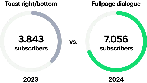
Let's start with how users sign up. We have drastically increased the subscriptions simply by replacing the classic (and more sober) toast at the bottom right with a more imposing timed dialogue that opens after only 5 seconds from the user's access to the page.
Let's take a step back. How are your forms set up?
Lightweight, few fields to fill in (email, country, area of interest) and a smooth experience, nothing that might overwhelm users. Add a picture of a person next to the form, because a human face helps build trust. And since no one wants to talk to a robot—least of all your company—use Google’s invisible reCaptcha to block spam and protect your database, without annoying users with endless image puzzles. This way, we stop the bots without ruining the user experience.
WYSIWYG? A fancy name f for something really simple.
Sending newsletters should be easy. That’s why at DataWeb we created a WYSIWYG interface—What You See Is What You Get: what you see is exactly what you send. In a nutshell, it will be easy for you and your staff to build graphically impeccable newsletters and DEMs, thanks to a composition tool: we create sturdy and flexible templates with images, animated gifs and multimedia content (always making sure even the older email clients aren’t left behind). Each newsletter is responsive: it reads well from smartphones, tablets and computers, without exception. And the aesthetics are consistent with communication: rounded, "pilled" buttons, logically organized content, bands of evidence to encourage interaction. All designed to capture the reader's eye and direct it towards the CTAs (calls to action, the buttons where to click) placed strategically, and with the unsubscribe link always available. Better to leave freedom than to force.
The fun really begins the moment you open it.
When newsletters are done well, it shows not only in the graphics but above all in performance. Newsletters remain one of the channels with the highest ROI in digital marketing. If well segmented and tailored, a newsletter can have open rates between 20% and 40%, much higher than organic social posts. This is why we don't just "send an email" but we create real communications that bring real people to click, discover, interact. And with the integrated tracking system, the conversion funnel is increasingly precise and we are able to monitor openings, clicks and post-sending behavior, so as to calibrate each sending based on real data and constantly improve performance.
The point is not just to be seen but to be clicked.